The 390px homepage, two options
Everything below is the real built homepage from the redesign-forecast preview,
rendered at 390 CSS pixels. The only difference between the three is the CSS noted under each. The
dashed red line sits at 750px, roughly what an iPhone leaves after Safari's chrome. What has to
land above that line is the input and the button.
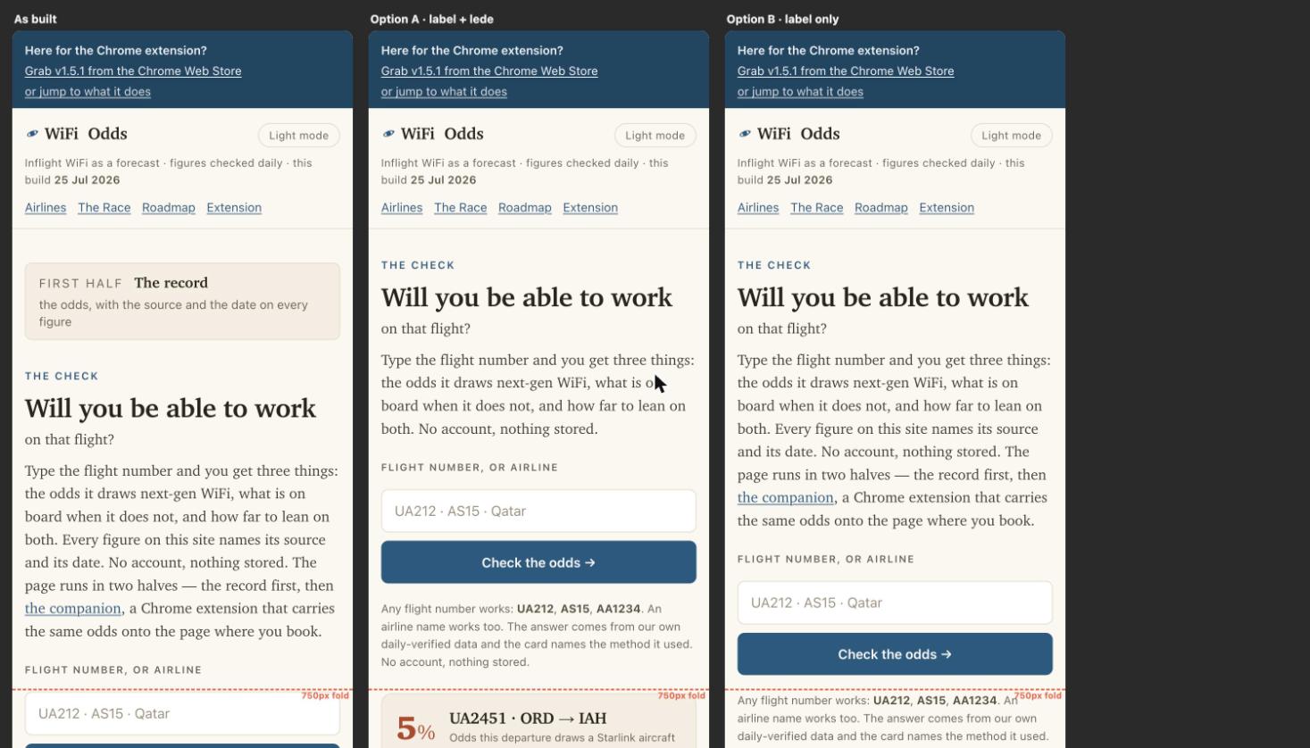
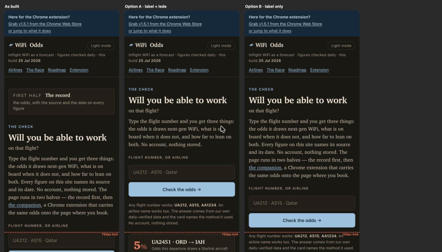
Where things land
| Variant | Input | Button | First odds figure | Against a 750px fold |
|---|---|---|---|---|
| As built | 757 | 817 | 1009 | button 67px below it |
| A · label and lede | 525 | 585 | 776 | clears by 165px |
| B · label only | 630 | 690 | 882 | clears by 60px |
Measured in the browser at a 390px viewport, 25 Jul 2026. Distances are from the top of the document to the top of the element.
What each one changes
Option A hides the “First half · The record” card below 640px and drops two sentences from the opening paragraph on small screens. What survives on a phone is the list of what you get, then “No account, nothing stored.”
Option B hides the “First half · The record” card below 640px and leaves the paragraph alone.
Those three are the quickest review if you open them on your phone. They are standalone copies, so nothing you do to them touches the preview or production.
What I think, and what I am unsure about
Option A is the one I would ship, and the reason is in the third column rather than the second. Your own component rules ask for the page's answer on the first screen at 390px, not just the form. A puts the first odds figure at 776px, which is 26px under the line and inside the fold on a taller handset. B leaves it at 882px, so B fixes the form and leaves the rule unmet.
The two sentences A drops on a phone are both doing work the page does again elsewhere. The source-and-date promise is demonstrated under every figure further down. The two-halves sentence describes a layout that does not exist at 390px, where the halves are already stacked in reading order, and the banner at the top offers the extension inside the first 85 pixels, so cutting the mention does not orphan the companion.
The case against A is that the phone and the desktop then say different things, and somebody has to remember that the next time the copy changes. If you would rather make one change than two, B is a real improvement and I would take it over shipping as built.
The thing I am least sure about is whether hiding the first halfmark costs anything at all. On a wide screen it labels a two-column split. At 390px I could not find a job for it, but you wrote the brief that card came from and I did not.