Rethinking P&P's navigation — and leveling up the polish
Three clickable directions, each answering the same two questions: where does site navigation live (and how do you jump between sub-sections of dense pages like Points Strategy), and what does a more polished P&P look like — benchmarked against point.me-class fintech/travel tools. Every mockup uses the real demo wallet ($2,805 across 4 programs), real card names, and the true-value ¢/$1 framing. Each is responsive and has a light/dark toggle.
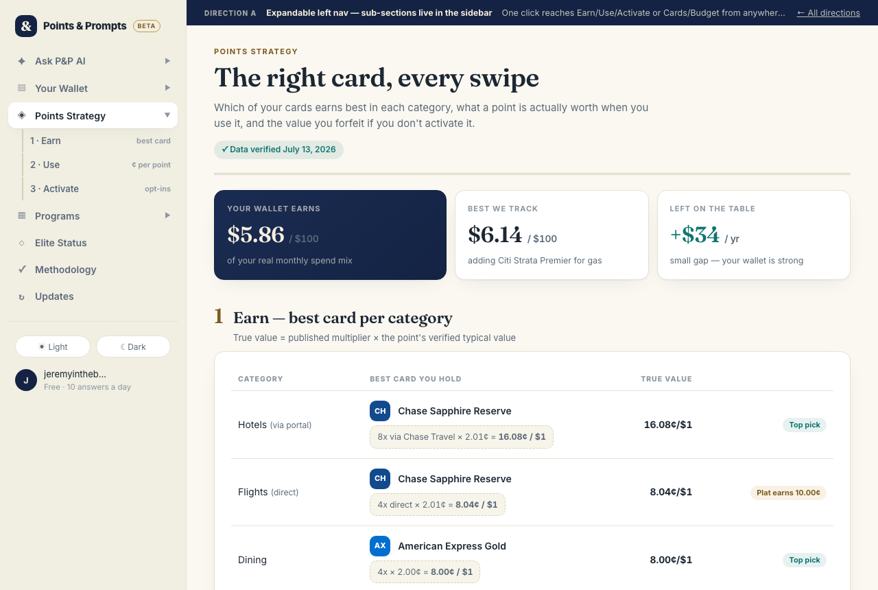
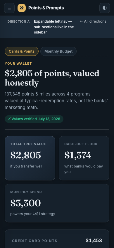
Expandable left nav — "Heritage"
The sidebar stays, but every top-level item can expand: Points Strategy → 1 Earn / 2 Use / 3 Activate, Wallet → Cards & Points / Monthly Budget, Ask AI → New chat + 3 recents, Programs → its four tabs. Sub-sections of any page are one click away from anywhere.
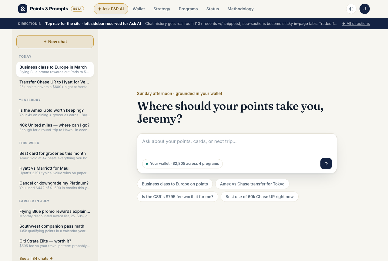
Top nav + AI-only sidebar — "Precision"
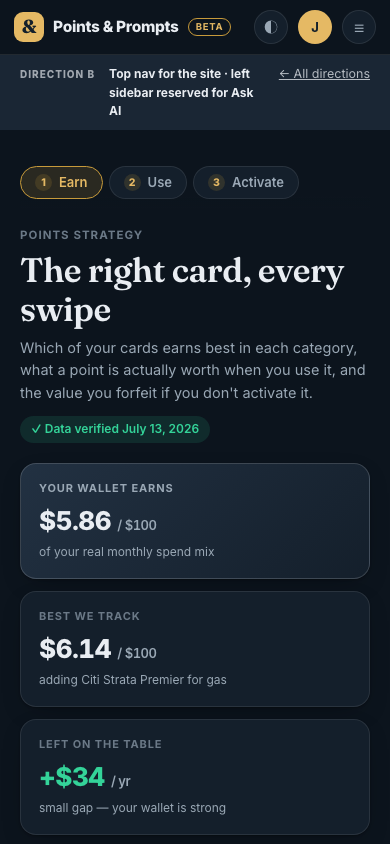
Site navigation moves to a slim top bar. The left sidebar now belongs to Ask P&P AI alone: New chat + 10 visible recents with snippets, grouped by day. Dense pages get sticky section tabs (1 Earn · 2 Use · 3 Activate) that follow you as you scroll.
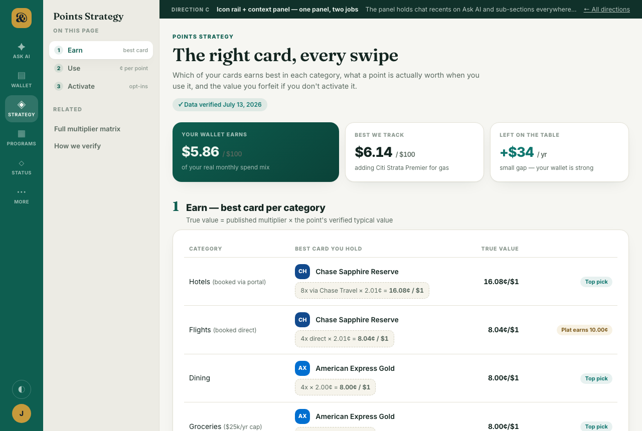
Icon rail + context panel — "Atlas"
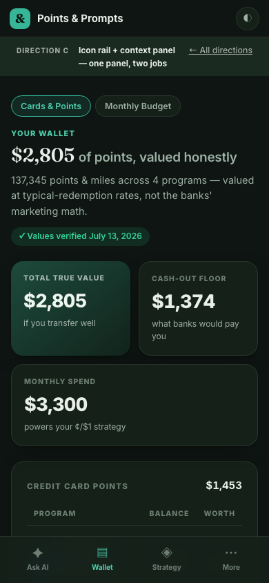
A compact icon rail holds the six site destinations; a second panel is contextual per page — on Ask AI it's your chat recents, on Wallet/Strategy it's the sub-sections ("On this page"). One consistent slot serves both of the sidebar's old jobs. Mobile gets a native-feeling bottom tab bar.
How to review
Open each direction and click through the three surfaces (Ask AI, Wallet, Strategy) using its own navigation — the nav is the prototype. Try the theme toggle in each, and resize to phone width (or open on your phone) to judge the mobile answer: drawer (A), sheet menu (B), bottom tabs (C).
Built as a static exploration for Jeremy — no changes to the production repo. Wallet figures ($2,805 · Amex MR 12,345 · Chase UR 60,000 · United 40,000 · Hyatt 25,000) and all ¢/$1 math mirror verified P&P data from 2026-07-13.